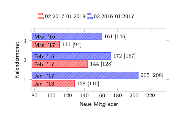
1  2018    128 110
3  2017    110 94
2  2017    144 128

1  2017     205  208
3  2016     161 146
2  2016     172 167
Ich habe hier den Plot einer komplizierten Tabelle, bei der die verschiedenfarbigen Balken zu gleichen Monaten, aber zu verschiedenen Jahren gehören. Die Legende beschreibt dies zwar, es ist aber auf den ersten Blick ggf. etwas verwirrend. Wie könnte ich an die y-Achse noch die konkreten Monatsnamen (oder auch die Monatszahl, egal..) mit Jahreszahl schreiben, z.B. so wie im 2. Bild? Möglichst zusäzlich zur normalen Achsennummerierung Die zugehörigen Jahreszahlen stehen auch in der Tabelle.
%\documentclass[]{article} \documentclass[border=5mm]{standalone} \usepackage{pgfplots, amsmath} \pgfplotsset{compat=1.13, %north west common/.style={postaction={pattern=north east lines}}, 2017AD/.style={common, pattern color=red!70, fill=red!40, draw=red}, 2018AD/.style={common, pattern color= blue!70, fill=blue!40, draw=blue}, }% \usetikzlibrary{patterns} \begin{document} \begin{tikzpicture}[scale=0.75] \begin{axis}[ xbar, enlarge x limits=0.35, % font=\footnotesize\sffamily, % ytick = data, y = 1cm, ymin=0.4, ymax=3.6, % %point meta=x, nodes near coords={\Mitglieder \ [\Fragen]}, every node near coord/.append style={xshift=0pt,font=\footnotesize},%anchor=east, visualization depends on={value \thisrowno{2} \as \Mitglieder}, visualization depends on={value \thisrowno{3} \as \Fragen}, % xlabel={Neue Mitglieder}, ylabel={Kalendermonat}, legend entries={02.2017-01.2018 ,02.2016-01.2017}, legend columns=2, legend style={anchor=south,legend pos= north west,yshift=1cm, draw=none } ] \addplot [2017AD] table[x index=2, y index=0] { 1 2018 128 110 3 2017 110 94 2 2017 144 128 }; \addplot [2018AD] table[x index=2, y index=0] { 1 2017 205 208 3 2016 161 146 2 2016 172 167 }; \end{axis} \end{tikzpicture} \end{document} |
|
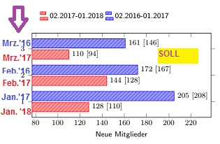
Eine recht ähnliche Frage wurde schon hier beantwortet, und die Antwort ist Grundlage für meine folgende Antwort. Der wesentliche Trick ist append after command={ % % von https://tex.stackexchange.com/a/155053/121799 coordinate (x) at (axis direction cs:-\pgfkeysvalueof{/data point/x}+\pgfkeysvalueof{/pgfplots/xmin},0) node [anchor=east] at (x|-mynode-\coordindex) {\MonatName{\Monat} '\Jahr}} wo eigentlich nur das mit der \documentclass[border=5mm]{standalone} \usepackage{xstring} % Hoechstwahrscheinlich gibt es das Macro schon irgendwo... \newcommand\MonatName[1]{\ifcase#1 Schmarrn \or Jan \or Feb \or Mrz \or Apr \or Mai \or Jun \or Jul \or Aug \or Sep \or Okt \or Nov \or Dez \fi} \usepackage{pgfplots, amsmath} \pgfplotsset{compat=1.13, %north west common/.style={postaction={pattern=north east lines}}, 2017AD/.style={common, pattern color=red!70, fill=red!40, draw=red}, 2018AD/.style={common, pattern color= blue!70, fill=blue!40, draw=blue}, }% \usetikzlibrary{patterns} \begin{document} \begin{tikzpicture}[scale=0.75] \begin{axis}[ xbar, enlarge x limits=0.35, % font=\footnotesize\sffamily, % ytick = data, y = 1cm, ymin=0.4, ymax=3.6, % nodes near coords={\Mitglieder \ [\Fragen]}, every node near coord/.append style={name=mynode-\coordindex, xshift=0pt,font=\footnotesize,append after command={ % % von https://tex.stackexchange.com/a/155053/121799 coordinate (x) at (axis direction cs:-\pgfkeysvalueof{/data point/x}+\pgfkeysvalueof{/pgfplots/xmin},0) node [anchor=west] at (x|-mynode-\coordindex) {\MonatName{\Monat} '\StrMid{\Jahr}{3}{4}}}},%anchor=east, visualization depends on={value \thisrowno{2} \as \Mitglieder}, visualization depends on={value \thisrowno{3} \as \Fragen}, visualization depends on={value \thisrowno{0} \as \Monat}, visualization depends on={value \thisrowno{1} \as \Jahr}, % xlabel={Neue Mitglieder}, ylabel={Kalendermonat}, legend entries={02.2017-01.2018 ,02.2016-01.2017}, legend columns=2, legend style={anchor=south,legend pos= north west,yshift=1cm, draw=none } ] \addplot [2017AD] table[x index=2, y index=0] { 1 2018 128 110 3 2017 110 94 2 2017 144 128 }; \addplot [2018AD] table[x index=2, y index=0] { 1 2017 205 208 3 2016 161 146 2 2016 172 167 }; \end{axis} \end{tikzpicture} \end{document}
Das letzte Bild ist gut! Das werde ich dann mal einarbeiten. Danke.
(09 Apr '18, 13:01)
cis
|