
|
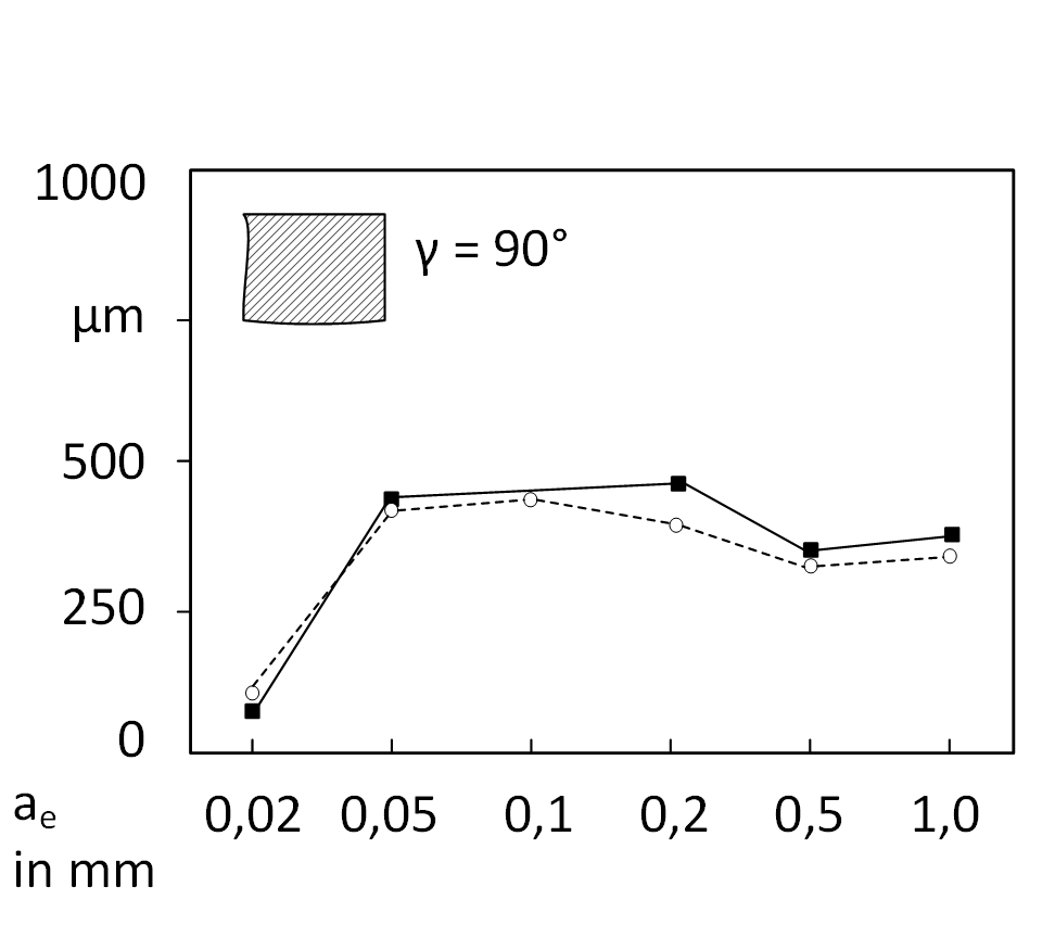
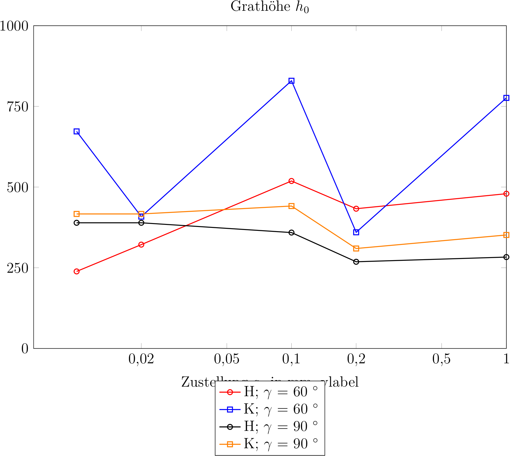
\documentclass[chapterprefix=true, 12pt, a4paper, oneside, parskip=half, listof=totoc, bibliography=totoc, numbers=noendperiod]{scrbook}
\usepackage{pgfplots}
\usepackage{tikz}
\begin{document}
\begin{figure}[H]
\begin{tikzpicture}
\begin{axis}[width=0.95\textwidth,height=0.48\textheight,ylabel shift = -1cm,
    /pgf/number format/.cd,
        use comma,
        1000 sep={},
    title={Grathöhe $h_{0}$},
    xlabel={Zustellung $a_{e}$ in mm,}
    ylabel={Grathöhe in $\mu$m, }
    xmin=0, xmax=1.0,
    ymin=0, ymax=1000,
    xtick={0,0.02,0.05,0.1,0.2,0.5,1.0},
    ytick={0,250,500,750,1000},
    legend style={at={(0.5,-0.1)},anchor=north},
    ymajorgrids=false,
    xmajorgrids=false,
    grid style=dashed
    ]

\addplot [color=red, thick, mark=o]    table[x=L, y=H60,] {RaRz.csv};
\addplot [color=blue, thick, mark=square]   table[x=L, y=K60,] {RaRz.csv};
\addplot [color=black, thick, mark=o]  table[x=L, y=H90,] {RaRz.csv};
\addplot [color=orange, thick, mark=square] table[x=L, y=K90,] {RaRz.csv};
\legend{H`enter code here`; $\gamma$ = 60 $^\circ$,K; $\gamma$ = 60 $^\circ$,H; $\gamma$ = 90 $^\circ$,K; $\gamma$ = 90 $^\circ$};
\end{axis}
\end{tikzpicture}
\caption{Unterschrift}
\label{img:dia1}
\end{figure}
\end{document}
Koordinaten: L H60 K60 H90 K90 0 251 388.547 119.126 68.89 0.01 238.7 672.49 389.371 416.768 0.02 321.729 408.473 0.1 518.886 829.402 359.083 441.275 0.2 432.966 359.907 268.583 309.692 1.0 479.48 776.298 283.119 351.612 |
|
Was du suchst nennt sich logarithmische Achsenskalierung. \documentclass[chapterprefix=true, 12pt, a4paper, oneside, parskip=half, listof=totoc, bibliography=totoc, numbers=noendperiod]{scrbook} \usepackage{pgfplots} \pgfplotsset{compat=newest} \begin{document} \begin{tikzpicture} \begin{semilogxaxis}[width=0.95\textwidth,height=0.48\textheight,ylabel shift = -1cm, title={Grathöhe $h_{0}$}, xlabel={Zustellung $a_{e}$ in mm,} ylabel={Grathöhe in $\mu$m, } xmin=0, xmax=1.0, ymin=0, ymax=1000, xtick={0,0.02,0.05,0.1,0.2,0.5,1.0}, ytick={0,250,500,750,1000}, log ticks with fixed point, legend style={at={(0.5,-0.1)},anchor=north}, ymajorgrids=false, xmajorgrids=false, grid style=dashed, /pgf/number format/.cd, use comma, 1000 sep={}, ] \addplot [color=red, thick, mark=o] table[x=L, y=H60,] {RaRz.csv}; \addplot [color=blue, thick, mark=square] table[x=L, y=K60,] {RaRz.csv}; \addplot [color=black, thick, mark=o] table[x=L, y=H90,] {RaRz.csv}; \addplot [color=orange, thick, mark=square] table[x=L, y=K90,] {RaRz.csv}; \legend{H; $\gamma$ = 60 $^\circ$,K; $\gamma$ = 60 $^\circ$,H; $\gamma$ = 90 $^\circ$,K; $\gamma$ = 90 $^\circ$}; \end{semilogxaxis} \end{tikzpicture} \end{document}
Vielen Dank für die schnelle Antwort! Drei Dinge sind mir aufgefallen: Die Graphen beginnen nicht bei x=0,02. Bei den Graphen K fehlt die Y-Koordinate zur X-Koordinate. Trotzdem setzt Latex dort einen Punkt hin... Gibt es auch eine Möglichkeit die Abstände der Skaleneinteilung zu reduzieren, sodass die Tabelle insgesamt kleiner wird?
(12 Apr '18, 14:21)
Christian01
@Christian01: Du hast ja auch die Werte 0 und 0.01 in Deinen CSV-Daten. Wenn Du die beiden nicht willst, kannst Du die ersten beiden Werte weglassen. Und welche Y-Koordinaten ausgegeben werden, hast Du selbst per
(12 Apr '18, 14:48)
saputello
|
|
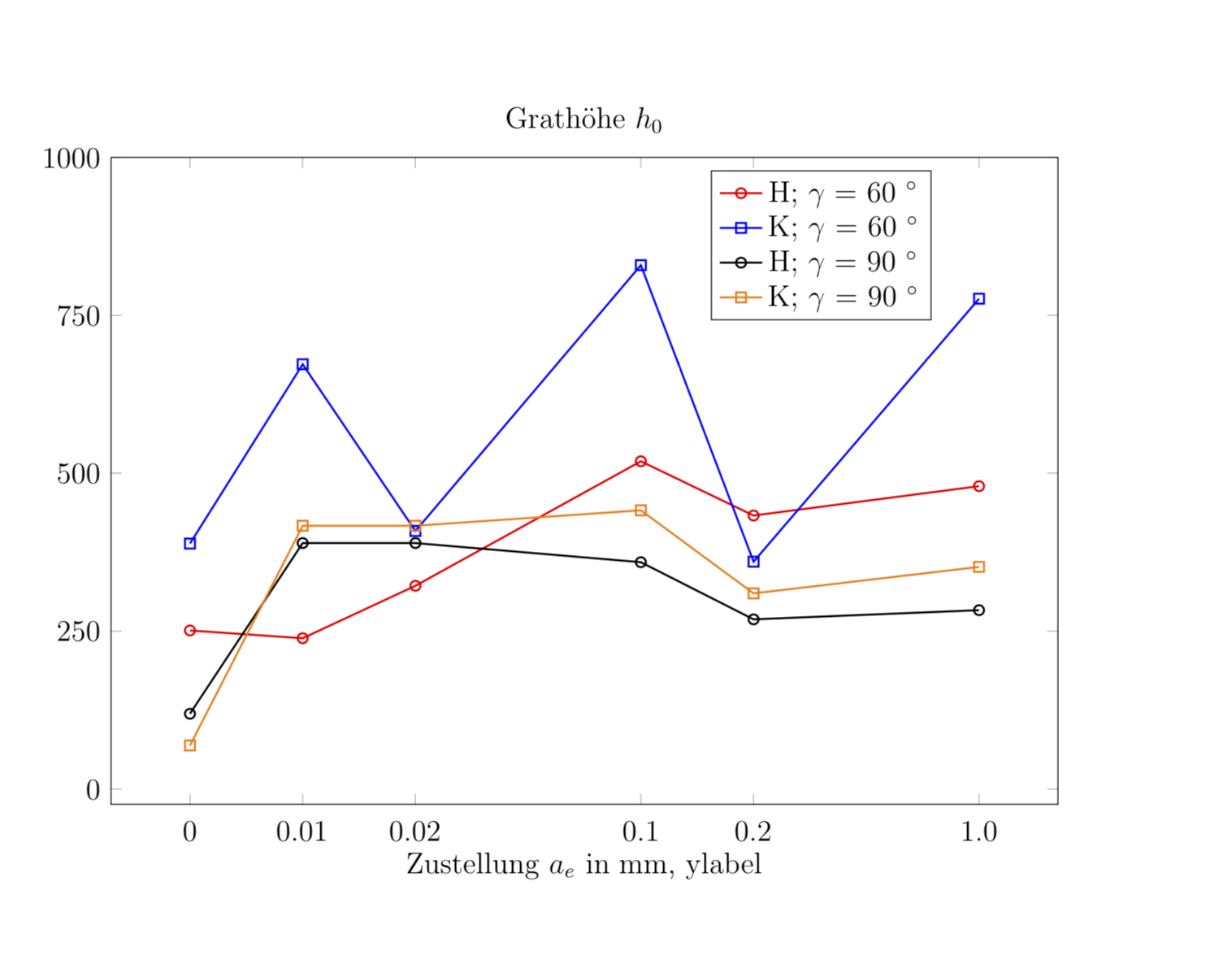
Hier ist noch ein anderer Vorschlag, der den Abstand zwischen den Punkten konstant hält. Die Idee ist, pgfplots einzureden, das seien symbolische Koordinaten. \documentclass[chapterprefix=true, 12pt, a4paper, oneside, parskip=half, listof=totoc, bibliography=totoc, numbers=noendperiod]{scrbook} \usepackage{pgfplots} \usepackage{tikz} \begin{document} \begin{tikzpicture} \begin{axis}[width=0.95\textwidth,height=0.48\textheight,ylabel shift = -1cm, /pgf/number format/.cd, use comma, 1000 sep={}, title={Grath\"ohe $h_{0}$}, xlabel={Zustellung $a_{e}$ in mm,} ylabel={Grathöhe in $\mu$m, } %xmin=0, xmax=1.0, ymin=0, ymax=1000, symbolic x coords={0,0.01,0.02,0.05,0.1,0.2,0.5,1.0}, xticklabel style={ anchor=base, yshift=-\baselineskip, }, xtick=data, ytick={0,250,500,750,1000}, legend style={at={(0.75,0.98)},anchor=north}, ymajorgrids=false, xmajorgrids=false, grid style=dashed, ] \addplot [color=red, thick, mark=o] table[x=L, y=H60,] {RaRz.csv}; \addplot [color=blue, thick, mark=square] table[x=L, y=K60,] {RaRz.csv}; \addplot [color=black, thick, mark=o] table[x=L, y=H90,] {RaRz.csv}; \addplot [color=orange, thick, mark=square] table[x=L, y=K90,] {RaRz.csv}; \legend{H; $\gamma$ = 60 $^\circ$,K; $\gamma$ = 60 $^\circ$,H; $\gamma$ = 90 $^\circ$,K; $\gamma$ = 90 $^\circ$}; \end{axis} \end{tikzpicture} \end{document}
Ich denke allerdings, dass Henri's Antwort sinnvoller ist. Danke dir, Henris Antwort gefällt mir auch besser.
(13 Apr '18, 10:39)
Christian01
|

Wie kann ich eine Minimalbeispiel einfügen? Die Texdatei dafür habe ich erstellt...
Per Markdown. Ich habe oben bereits einen Link und mehr dazu geliefert. Mal meine Änderung in Revision 5 anzuschauen, wäre auch eine gute Idee. Und dann haben wir noch den Sandkasten zum Übern und weitere Meta-Fragen wie: Wie gebe ich hier Code (im Fließtext) ein?
@Christian01 Du sagst, dass Du an den Achsen Ticks für
0,02,0,050,10,20,5und1,0haben möchtest. In Deiner Tabelle mit den Koordinaten kommen aber zusätzlich Werte fürL=0undL=0.01vor. Sollen die ignoriert werden? Dafür gibt es keine Zeile mitL=0.5. In der Zeile für mitL=0.02ist nicht klar zu welchen Spalten die beiden Werte gehören bzw. für welche Spalten die Werte fehlen. Zellen die keine Werte enthalten musst Du mit{}markieren.